‏إظهار الرسائل ذات التسميات تائثيرات. إظهار كافة الرسائل

Beautiful Warmtone and Cooltone Photo Effects Photoshop Tutorial

Final Image
Back in the day, when one would print their own black and white prints, you had a choice of a zillion different papers. They basically boiled down to cooltone and warmtone papers. This combined with different developers gave one an array of tones to choose from for any given picture. Sadly, nowadays it’s getting harder to find specific papers and certain developers are no longer being manufactured. In the digital era, most people who might not have gone through the trouble of trying different tones of paper (or even B&W printing for that matter) will be satisfied with converting a color image to a straight B&W palette by simply desaturating the color. Today we’re going to take it a step further. Achieving different tones for specific images will help you create different moods according to the overall look you’re going for.
original_image

Cooltone Effect

Let’s to start of with a cooltone effect. First thing we need to do is convert the color image to Black & White by using the Black & White layer adjustment found at the bottom of your layers palette. This will bring up the Black and White conversion window from where you can choose a variety of predefined adjustments that simulate different photo filters. Choose the filter setting most suitable for your image. You can also leave it in “Default” and tweak each color rendition separately. In my case, I used a mix between a high contrast blue filter to light up the highlights and a red filter to darken the clouds and shadows by masking out the areas with the adjustment layer’s mask. Now that we have a Black & White image we’re ready to cool it down!
original_image
Next thing we’re going to do is open up our curves adjustments window. I’m going to show what your red channel, green channel and blue channel should look like. Basically what we want to do is remove some red from the midtones, a little tiny bit of green and then add some blue. Carefull with the green curve. If you subtract too much the tone will have a magenta cast, if you subtract too little and the blue will be more of an aqua tone.
original_image
original_image
original_image
original_image
Now, for the effect to look natural what we want to do is to bring it down a bit. One way to do this is by simple using the opacity slider for this adjustment layer to say, 50%. Not only that but, for a more realistic effect, we’re going to mask out some of the midtones and highlights and leave the shadows with a black blue hue. To do this, select the layer mask and go to Select > Color Range. There you can select the tones you want to subtract by simply clicking on the image with the drop icon. Click on a middle grey and then check the “invert” checkbox. This way you’ll recover some pure white and the overall image won’t look so murky blue.
original_image
As you are doing this, you can see the same selection on your layer’s mask as the one in your color range window. All you have to do is press OK.
If for any reason you want to modify your selection, simply click on the mask while holding down the CTRL key. Now that you have your layer’s mask selected you can go to Select > Refine Edge. In this window you can tweak your selection by using a variety of sliders to feather and smoothen the edge of your selection.
original_image
If you want to check out your layer’s mask on screen, just press on it while holding down the ALT key. Now you can modify using your black and white brush any specific area. For more unobtrusive modification be sure to drop the opacity level on the brush as well as the hardness of it.
original_image

Warmtone Effect

To achieve a warmtone effect we’re going to create a different curves adjustment. Now, the difference between this effect and say, a sepia effect is that warmtone B&W paper when not toned in sepia toners has a natural warmth to it. The midtones have more of an olive tint to them where as the white is more of a creamy palette. These papers are especially responsive to toners but have a very interesting color palette all to themselves. This is what we’re looking to recreate.
Go ahead and turn off the curves adjustment layer you’ve just created by clicking on the little eye and open a new curves adjustment layer. This time, recreate the following curves for your red, green and blue channel:
original_image
original_image
original_image
As you would expect, we’re doing quite the opposite as before. Instead of adding a whole lot of blues, we’re subtracting them. Also, we’ll need to take away a little bit of red and green. As you did previously, go ahead and use color range to select the midtones in your layer’s mask. In this case, I dropped the opacity to 70%.
original_image
That’s pretty much all there is to it. I hope you found this tutorial helps to add a little style to your B&W images. You can download the curves adjustments shown in this tutorial Here and Here.
Here’s your before and after pics:

Original Image:

original_image

Cooltone Image:

Final Image

Warmtone Image:

original_image

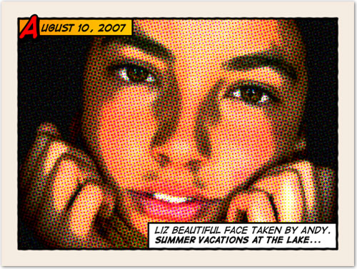
Old halftone print effect


Download and open this photo in Photoshop. Now we are going to increase the overall contrast of the picture by burning it a bit. Go to IMAGE > ADJUSTMENTS > LEVELS…With this image we are going to set the INPUT LEVELS to 60 / 1.00 / 220. But this is only for this example. Choose the best settings for each photo.

In this step we are going to give the photo an illustrated look with some graininess to give the illusion of an old and bad quality paper. It is not a realistic effect, it is just some distortion to the image to help us achieve the final look. Go to FILTERS > ARTISTIC > FILM GRAIN. In this case we are going to use: GRAIN: 4, HIGHLIGHT AREA: 0, INTENSITY: 10. Try different settings for different photos.

Duplicate the layer and name the new layer HALFTONE

In this step we are going apply a halftone pattern to the image to give the final old comic book printing effect. Go to FILTER > PIXELATE > COLOR HALFTONE. Set MAX RADIUS: 4 and leave the rest with the default values. Press OK and then go to the LAYERS PALETTE and set the BLENDING MODE to DARKEN.

Adding comic book elements to the picture


The effect looks nice so far. It is not a realistic old comic book effect, it simple resembles that look. To make it more real, now comes the fun part. We are going to add some unique elements that are very popular on comic books and strips
Select the HALFTONE layer and set a STROKE LAYER STYLE of WIDTH: 20px, POSITION: Inside and COLOR: #F5ECE1.

Add a new layer and draw a small rectangle at the top left of the frame of the image. Give it a STROKE of 3 pixels and paint it orange. An orange to yellow gradient looks better. Draw another rectangle, a bit larger this time, on the lower left corner of the frame. Give it a STROKE of 3 pixels and paint it white. The final result should be like the one below:

Lets add a border to the image: Add a new empty layer above the layer containing the rectangles we created in the previous step. Select the RECTANGLE SELECTION TOOL from the TOOLS PALETTE. Draw a selection from the top left (right inside the frame) to the bottom right border of the image.

Go to EDIT > STROKE, set WIDTH: 4px, COLOR: BLACK, LOCATION CENTER and press OK.
DESELECT the current selection and go to FILTER > BLUR > BLUR MORE. Then apply a small distortion using FILTER > DISTORT > RIPPLE… (Amount 20%, Size Medium). Now, lets sharpen the stroke a bit with FILTER > SHARPEN MORE and there you have a nice simulated hand drawn border.

Adding captions using a comic book font

To add captions to the photo you can use any font you like, but only using fonts specially designed for comic books you will be able to achieve the desired look. Download the free font Digital Strip and install it. At the end of this article you will find a lot of free and commercial comic book fonts and resources.
Using the Digital Strip font you’ve just downloaded, type a date on the top orange rectangle. Play with the first letter of the text by adding a stroke, a shadow and a bright contrasting color.
Then write a caption for the photo at the bottom white rectangle. Highlighting some words in bold also looks good.
And that’s all. Your image should look similar to the one below:
Click on the image to see a larger and uncompressed version.


تكسترات خاصة بالفوتوشوب وسينما 4D و3D ماكس


http://adf.ly/1BqDqs                                                              wool
http://adf.ly/1BqDv3                                                            Wood
http://adf.ly/1BqDyA                                                              wall
http://adf.ly/1BqDzR                                                            smoke
http://adf.ly/1BqE2K                                                                sky
http://adf.ly/1BqE40                                                              metal
http://adf.ly/1BqE58                                                  merble stone
http://adf.ly/1BqE6c                                               leather surface
http://adf.ly/1BqE8B                                                          Asphalt

topaz action.atn Download

Download 


topaz action__ 4shared

اكشن فوتوشوب


اكشن فوتوشوب 2012
 
التقييم: 
مرات التحميل : 22442

اكشن فوتوشوب احترافي
 
التقييم: 
مرات التحميل : 23297

اكشن فوتوشوب 2011
 
التقييم: 
مرات التحميل : 18197

اكشن فوتوشوب رهيب
 
التقييم: 
مرات التحميل : 15613

اكشن فوتوشوب روعه
 
التقييم: 
مرات التحميل : 19236

اكشن للفوتوشوب بالصور
 
التقييم: 
مرات التحميل : 14930

اكشن للفوتوشوب 2011
 
التقييم: 
مرات التحميل : 15392

اكشن تصفية الصورة
 
التقييم: 
مرات التحميل : 19550

أكشن وردي
 
التقييم: 
مرات التحميل : 11385

أكشن السطوع
 
التقييم: 
مرات التحميل : 20068

اكشن كرتون
 
التقييم: 
مرات التحميل : 51934

اكشن تأثيرات
 
التقييم: 
مرات التحميل : 12796

تاثير اكشنات الصور
 
التقييم: 
مرات التحميل : 10277

اكشن تاثيرات الالوان
 
التقييم: 
مرات التحميل : 14582

Follow Me On Instagram

تسجيل الدخول بمدونات بلوجر